Campus Name
Our campus name, like our logo, is a core part of our identity. Use it consistently so communications are clear and aligned with the UC San Diego brand.
- Default: UC San Diego
- Use UCSD only in: hashtags, email addresses, URLs
- Formal use (when needed): University of California San Diego (no comma)
Learn more about how to use the Campus Name at:

RRSS Main Logo
Includes internal-facing admin and support units:
- RRSS Leadership
- Human Resources
- Facilities and Building Serivces
- Finance and Marketing

Customer-Facing Unit Logos

Logo Usage
For guidance on using our logo, please visit the UC San Diego branding site for general standards. RRSS branding is aligned with the University’s standards to ensure consistency, clarity, and visual integrity in every application. Learn more at...
Color Palette
Ensuring the accuracy of UC San Diego’s brand colors in both print and digital is essential for consistent university communications and representation. For print materials, use the CMYK breakdown or PMS number, and for digital materials, use RGB or HEX. Use only the color codes listed here or download the approved color swatches below.
Core Colors
Our core colors are the official colors of UC San Diego. Consistent use of these colors in all branding is essential to establishing our identity.
UC San Diego Navy
Pantone 2767
C100 M86 Y42 K42
R24 G43 B73
#182B49
UC San Diego Blue
Pantone 3015
C100 M35 Y3 K21
R0 G98 B155
#00629B
UC San Diego Yellow
Pantone 116
C0 M14 Y100 K0
R255 G205 B0
#FFCD00
UC San Diego Gold
Pantone 1245
C6 M35 Y99 K18
R198 G146 B20
#C69214
Accents
Our palette of accent colors have been developed to add energy and amplify the UC San Diego brand. Inspired by our vibrant natural surroundings, accent colors can be used in conjunction with our core colors to create materials that push boundaries while still recognizable as UC San Diego.
Turquoise
Pantone 3115
C70 M0 Y16 K0
R0 G198 B215
#00C6D7
Magenta
Pantone 674
C13 M83 Y0 K0
R212 G98 B173
#D462AD
Sand
Pantone 9285
C4 M6 Y10 K0
R245 G240 B230
#F5F0E6
Citron
Pantone 3945
C3 M0 Y90 K0
R243 G229 B0
#F3E500
Orange
Pantone 144
C0 M51 Y100 K0
R252 G137 B0
#FC8900
Green
Pantone 7490
C60 M23 Y92 K5
R110 G150 B59
#6E963B
Neutrals
Including neutrals into our color palette is essential for long-term adaptability. While these neutral colors may not play a major role in branded materials, they provide options for contrast and flexibility.
Black
Pantone Black
C0 M0 Y0 K100
R0 G0 B0
#000000
Cool Gray
Pantone Cool Gray 9
C30 M22 Y17 K57
R116 G118 B120
#747678
Stone
Pantone 401
C10 M11 Y17 K27
R182 G177 B169
#B6B1A9
White
C0 M0 Y0 K0
R255 G255 B255
#FFFFFF
Accessible Brand Color Combinations
To find an accessible color combination, select a background color and a text color from the list below. Your color contrast results (including the contrast ratio) will appear below the sample text. A green check indicates that the color combination passes Level AA requirements for the specified type size. A red x indicates that the color combination does not pass for the specified type size.
Typography
Typography is a key visual tool for telling our story with clarity and impact. At UC San Diego, our type system supports effective communication that is dynamic, legible, and unmistakably on brand. RRSS follows these guidelines to ensure readability and visual unity across all materials. Learn more at...
Brand Fonts
Brix Sans (Primary)
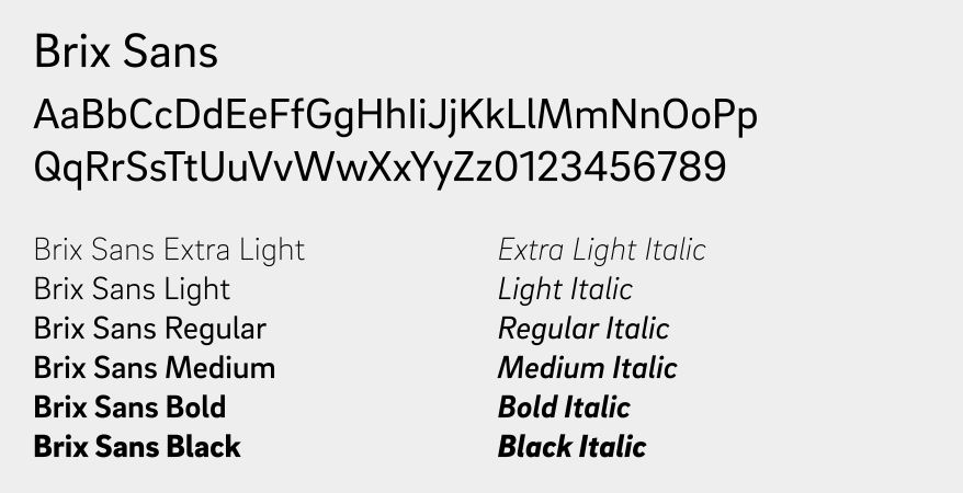
Refrigerator Deluxe (Headline)

Chronicle (Body Copy)

Type Hierarchy
This is the recommended type hierarchy for standard use on materials. When in doubt, see the tips below.

H1 HEADING
Refrigerator Deluxe Heavy
All Caps
0 Tracking
85% Leading

H2 SUBHEADING
Brix Black
All Caps
175 Tracking
160% Leading

H3 EYEBROWS
Refrigerator Deluxe Extra Bold
All Caps
80 Tracking
130% Leading

BODY COPY
Brix Regular & Italic
0 Tracking
140% Leading
Typesetting Best Practices
Ensuring that any content is legible and readable is essential for communication to all audiences. While certain aspects of type setting can vary based on scale and application, there are some basics that should always be considered:
- For print, body copy should be sized between 7-11 pts. For digital, font size should be between 12-16 px.
- Headlines should always be differentiated from body copy through size, color and/or font differentiation.
- When placing copy over complex backgrounds, like photos, always ensure legibility of content is not compromised.
- Body copy should not be tracked more than 20 pts.
- Body copy should not be set in all caps or all bold as it is dense and hard to read.